
2016
_User Research
_IA
_UX
_UI
_Rapid Prototyping
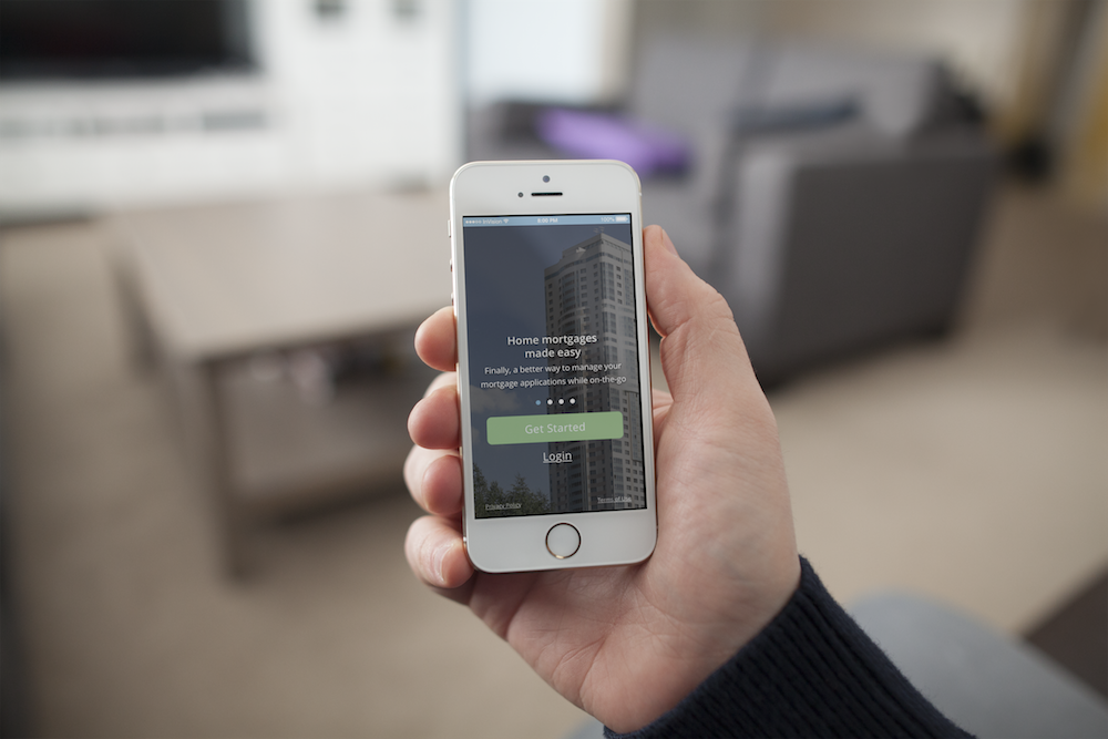
StreamLoan iOS Visual Redesign
Navigating through a mortgage application process is daunting—even with an agent.
StreamLoan aims to ease the pain of getting all your paperwork in the same place. The mobile solution, available in the App Store, aids collaboration between home-buyers and lenders by giving them a hub to collect sensitive financial documentation for the mortgage process.
Our challenge: to redesign the platform to optimize user experience and increase the ease in performing tasks from the applicant's side.
How can we improve user comprehension of the StreamLoan iOS app?
My Role: Product Designer
As a generalist on the design team, I conducted usability testing, synthesized findings, and ideated and created low-fidelity and high-fidelity prototypes. I focused largely on the "Create Property" and "Create Bundles" flows, along with establishing a new system for UI elements. I worked closely with the founders and remote developers to iterate an improved experience for the core functionality.
CLARIFYING FUNCTIONALITY, MINIMIZING FRICTION
Through understanding the typical user and performing basic usability tests, our team successfully improved clarity and minimized friction around bundles, a core functionality within the product that provides collaborative document sharing between home-buyers and lending agents.

So, what Types of Home-Buyers Use StreamLoan?
As part of the research phase, the design team conducted multiple interviews with users to created two descriptive personas that outline typical user behaviors, understand the loan process, and empathize with their needs & goals.

We tested the original StreamLoan mobile app with 6 people who recently purchased homes, and it was super interesting to interview users while also observing how they interacted with the app. aking notes on these interactions, we were able to bucket the usability test findings into common themes. The exercise revealed six main problem areas:
Comprehension/ Navigation
Accounts
Bundles and Progress
Look and Feel
Sign Up
Notifications
Participants didn't find the application secure/trustworthy, an important quality for a product that aggregates a large amount of personal and financial information.
This was due mainly to difficulties understanding how to utilize the app thanks to:
Vague UI and iconography; users had difficulty interpreting the actions they needed and desired to make as they navigated through the product.
Security was a big concern, especially during the sign-up process.
All users struggled to add accounts quickly and with minimal cognitive load.
Labyrinthine information architecture.
Solving the Problem
We made several recommendations to tackle the six main problem areas.
Redesign information hierarchy to provide the user with clear direction.
Adjust colors, tone, look and feel to convey StreamLoan’s core values of security and simplicity.
Provide clarity around the account and bundle process.
Minimize cognitive load in each flow (the amount of effort a user thinks is required to complete a task).
Design and implement terminology and icons that make sense to the user.
Reduce duplicate functionality.
To get these solutions on paper and visualized, we went through several rounds of diverge and converge exercises to build off each other's ideas.
Clarifying the Information Architecture
To tackle duplicate functionality, cognitive load, and extensive navigational issues, we did an intensive round of card-sorting to create a simplified hierarchy for the app's information architecture.
Before

After

How do we create a flow that is seamless and simple?

Connecting with User Aspirations
Across the board, the user experience needed a reduction in visual clutter. But it also needed to build in feedback from the UI that more efficiently directs users to their immediate goals within the app, while connecting with their emotional aspirations.
Let users know they're on the right track.
As a designer focused on improving the bundles functionality, I brainstormed ways to reduce the amount of effort it took for a user to create a designated space in the product for "bundling" important financial documents related to one property.
This meant not only reducing the number of fields in one screen, but also thinking of ways to incorporate readily available information on Zillow and Redfin that could reduce the amount of input required from the user, period.

Final Prototype
You found your dream home and now you need to be approved for a loan. Your agent has recommended that you use StreamLoan to send and receive the necessary documents, and tells you to sign up and enter your property information. How would you go about getting started?